Responsive Design – the secret of smart websites and happy customers
You are, for sure, well aware of the increased tendency of population world-wide to use many devices to surf the internet for different purposes. In a century when everything is on the rush, mobile devices are the best answer for our needs to access information while on the move. This makes it clear, doesn’t it? Your website must be mobile friendly!
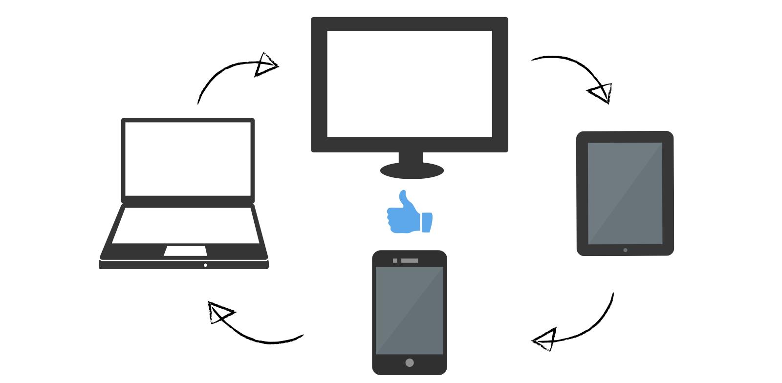
You have to provide users the best browsing experience by allowing them to easily access your website, no matter the device they use. With a responsive website, they won’t have to resize and scroll for a better navigation session, but they’ll simply have it, as your website can adapt to different screen resolutions and devices (PC, laptops, tablets, smartphones, etc), without suffering major degradation.
Need to see proof?
All you have to do is to take a look at your Google Analytics report. More than likely you will see various devices that people are using to browse through your website. While there, check the bounce rate of mobile devices. It is probably quite high. So, why lose valuable traffic? Make your customers’ stay a pleasant one!
One single design for all devices
On average, about 40% of total site traffic comes from mobile devices. That’s a big pool of customers that you have to keep close. Having a responsive design means that you don’t need to make a different one for every device. It would be both costly and inefficient. Therefore, have your website adapt so that all of the content, images and structure will remain the same on any device. The efforts consists of a mix of flexible grids and layouts, images and CSS media queries which will make all the difference.
Google recommends
Yes, it’s true! Google prefers responsive web design as the recommended mobile configuration. And it makes sense if you think about it. If you choose to make a mobile site different to your desktop site, you will have a different URL and different HTML for each of them. This way, Google will index several versions of your site, instead of just one that will gather all the traffic, from one single URL and the same HTML available across all devices.
Better user experience and higher conversion rates
By adapting your website to the users’ needs and being responsive, you will be able to increase the conversion rate for all the mobile users. If your website has a well-designed user interface, the visitors will stay longer on the page and the bounce rate will decrease, therefore increasing the chances of visitors converting into buyers. Otherwise, if a website is not working well on mobile device, users will be unable to convert, and you risk to lose a significant number of possible buyers.
Cost and time efficient
You may think having a responsive web design is expensive. Not true! It is more expensive to duplicate a website for mobile and other devices. By doing that, your costs will be higher because you will have more versions of your website to maintain. So, if you choose to make a responsive website you can save both money and time on the long term, with the added value of happier (and more!) customers.